Your life-
organized, secured
Keeping what's important to you,
secure from others
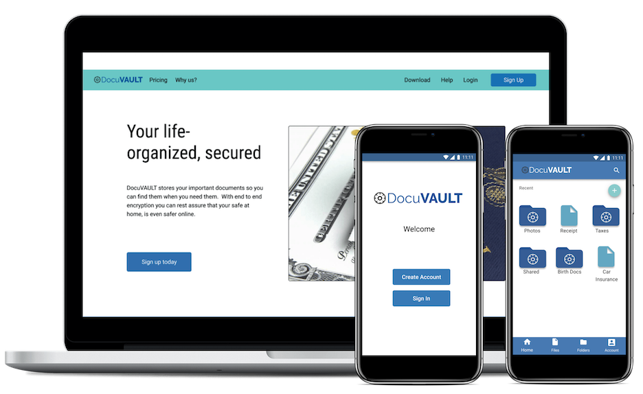
Mobile Prototype Desktop Prototype
Keeping what's important to you,
secure from others
User Research | UX Design | Information Architecture | Branding | Visual Design
Figma | UsabilityHub | Google Forms
Competitive Analysis | User Surveys | User Stories | User Personas | User Flows | User Testing | Logo Design | Style Guide | Wireframes | Prototype
Our client was looking to create a product the cloud storage organization market with multiple features such as creating/uploading content and the ability to create a “network effect” among others
Finding the right product for a crowded market proved challenging. It took a great deal of research and analyzing the data to determine where any gaps lied, and what users needed. Narrowing down the requested features to what the market needed
We took on a design-sprint approach for our initial direction of the project and then progressed through a full implementation of the product with an evaluation heavy design approach, allowing us to reduce risk and uncertainty
With a crowded market, we needed to identify who the competitors were and any gaps or overlaps in features within them. We looked into Drive, Dropbox and Pinterest discovering what these companies had or lacked to determine the path that our new product would go

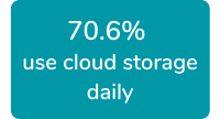
We asked users various questions including what apps they use and why. As well as features they liked or needed, and any opportunities or frustrations
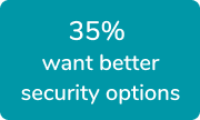
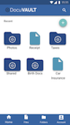
After some discussion we realized that people already have an app for their work items, photos and documents. But what about their important documents that need more security? Warranty info, insurance docs, birth certificates? All the documents that you need backed up for easy access, but don’t want easy access for others to steal
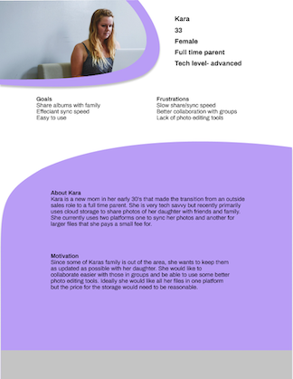
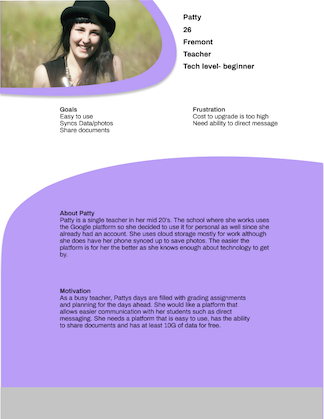
After gathering the survey data, we created Personas based on the results to help put a backstory to our users
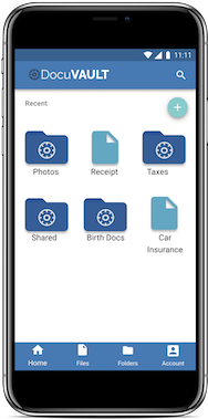
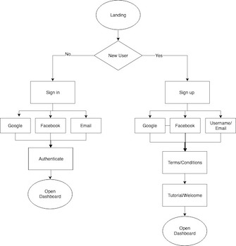
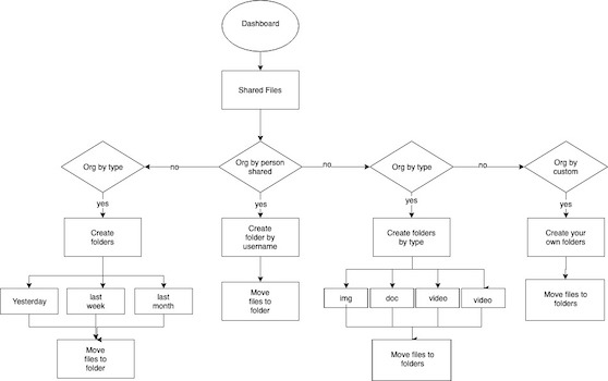
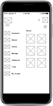
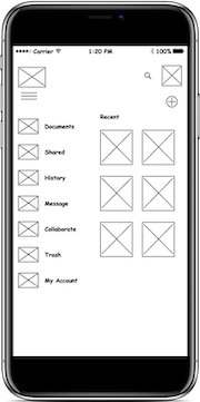
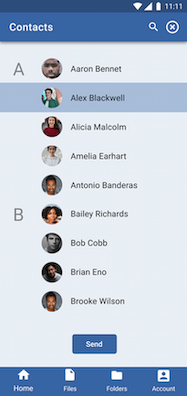
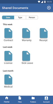
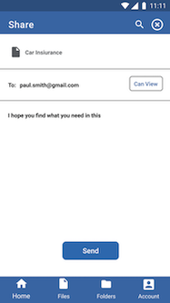
Now began determining the feature that users wanted, were familiar with based on the surveys, and would apply to this new product. It was determined that the most important features would be to create an account, share items, upload items and organize items that had been shared.
High Priority Needs:
Sign up/into account
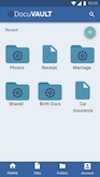
Upload content
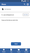
Share files/folders
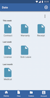
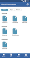
Organize shared content
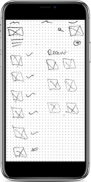
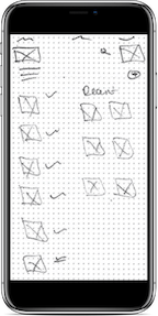
Getting the framework of our product was the next step. We wanted to ensure a seamless flow within the features. Creating a user flow allowed us to have a solid base for the next steps
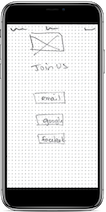
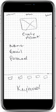
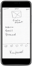
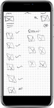
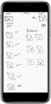
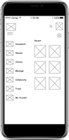
Just like anything, there was a long journey from initial user flows to the final high fidelity prototypes. Within that journey came multiple iterations of sketches and wireframes really nailing down an easy flow for the user without overwhelming the unnecessary features
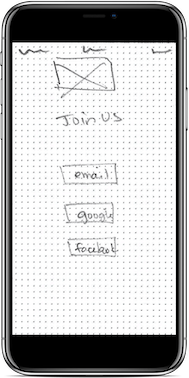


We created a prototype from the wireframes and had three users test some basic requests. We asked them to sign up for an account, upload content, organize items from a shared folder and create a file
Key Findings: Difficulty navigating when more than one level in. Need for navigation menu or back button
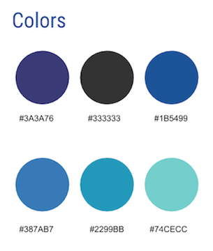
Now that we had an idea of what the product was and how it would be mocked up, we needed a basis for design. Breaking down the ideas of security and its meaning, we came up with a vault and paired that with the idea that documents would be stored. We wanted to create a brand that would evoke the feeling of security, trust and practicality and that laid groundwork for a color scheme including blues, green and gray

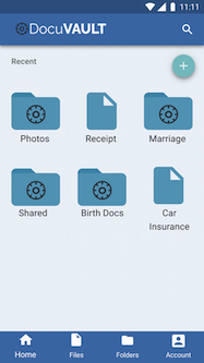
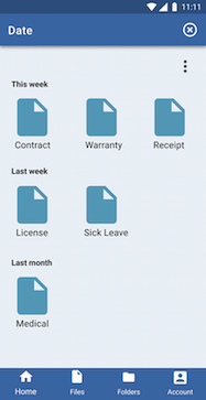


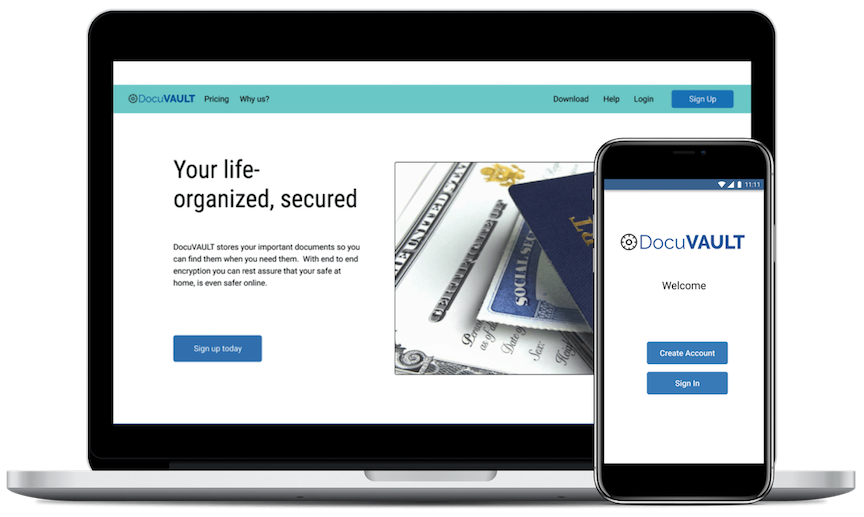
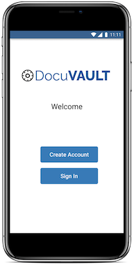
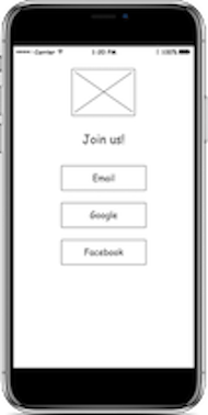
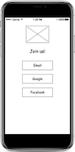
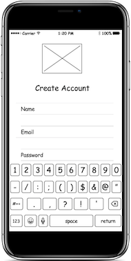
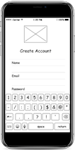
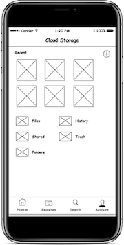
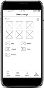
Once the branding was established, it was onto creating a high fidelity mockup and another round of testing. The basis of these compared to the initial sketches remained the same, however features and visual graphics were changed to show continuity between the mobile and the desktop version
When our client came to us with an idea for a cloud storage app, we weren’t sure exactly where we would end up. With so many competitors and duplicate apps, we needed to be different. The surveys and usability testing proved to be most useful to us to see what people used, needed and preferred. We were able to develop a product that users connected with and addressed the initial desires of the client