User Research | UX Design | Information Architecture | Branding | Visual Design
Figma | Draw.io | Google Forms
Competitive Analysis | User Surveys | User Stories | User Personas | User Flows | User Testing | Logo Design | Style Guide | Wireframes | Prototype
We were asked to build a product in the recipe organization and search market with multiple features including creating/uploading content and the ability to search based on on-hand items. With the multitude of recipe apps on the market, we were tasked at creating a product that would stand out from the competition.
Creating a product including all the necessary features, yet standing out in a crowded market was our challenge. We needed to ensure we researched users to see what features were lacking and how to create a product for all.
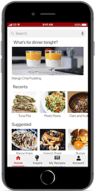
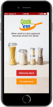
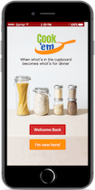
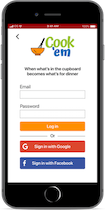
After all of our initial research was complete, we came up with Cook ‘em. This product bridges the gaps in many of the other recipe apps and is engaging and simple for any user to understand.
With so many recipe search and storage apps on the market, it was essential that we determine what worked and what was missing. We narrowed down the competition to those which contained some features that we also wanted to include. The three competitors were Super Cook, All Recipes and Big Oven. Super Cook is a web responsive site which is specifically geared toward ingredient search.

We reached out to a variety of users and asked them a multitude of questions to narrow down the potential product features.


After looking at the data and thinking about how to apply this to the market, we realized that the variety of apps and sites were familiar with had different features, but if we could take those, as well as any lacking and include them in our project that we could create some room in the market for a new product which could satisfy users needs.
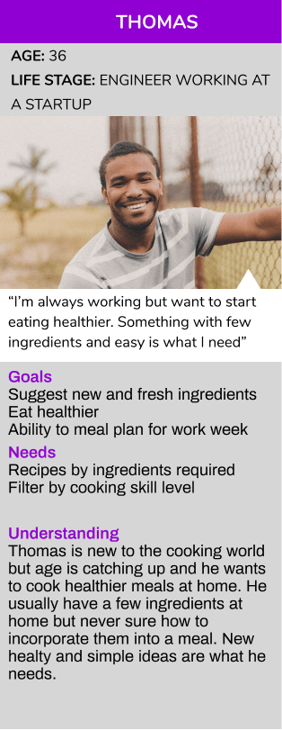
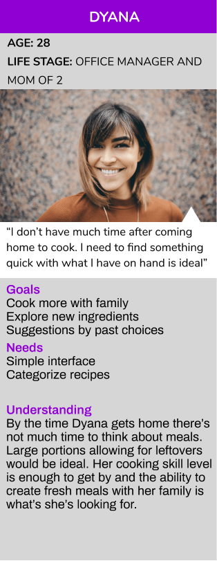
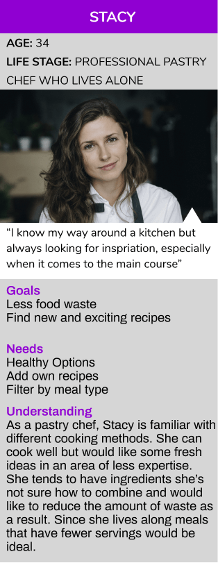
Based on the user survey data we collected, we created Personas to help put a backstory to our users
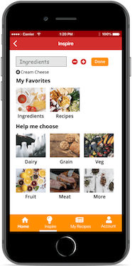
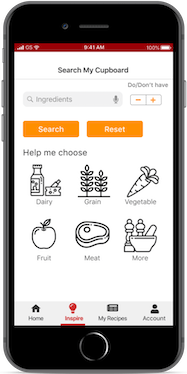
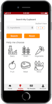
After analyzing the data from the surveys and research, we now were tasked with determining what features would be in this new product. It was determined that the most important features would be to create an account, select ingredients, save recipes, and delete ingredients once added.
High Priority Needs:
Select ingredients
Create an account
Save recipes
Delete ingredients once added
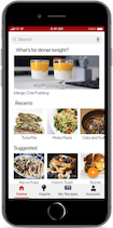
Getting the framework of our product was the next step. We wanted to ensure a seamless flow within the features. Creating a user flow allowed us to have a solid base for the next steps
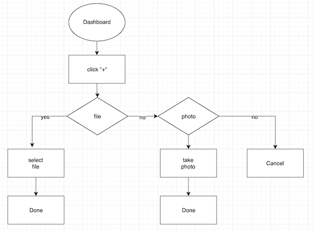
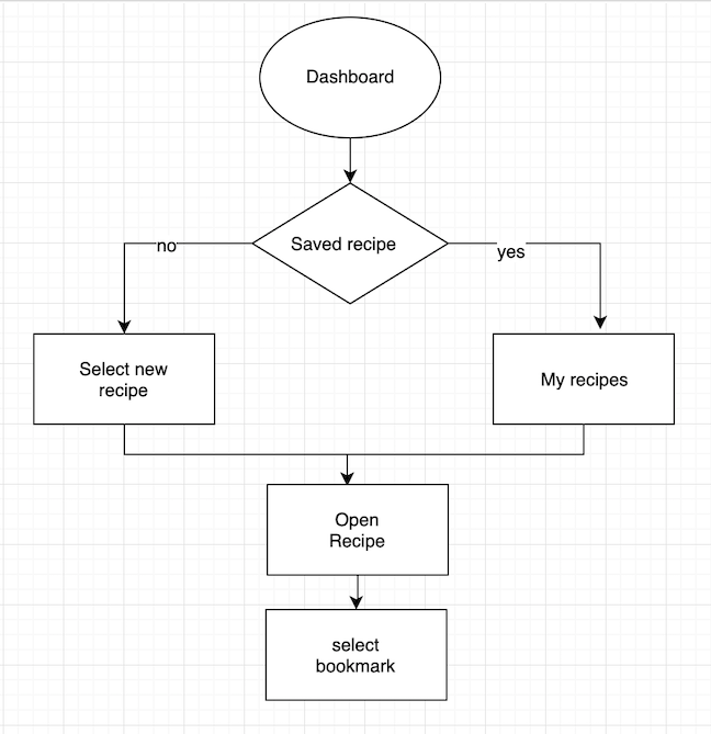
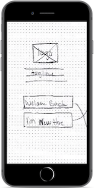
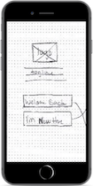
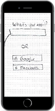
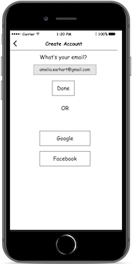
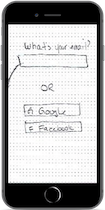
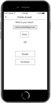
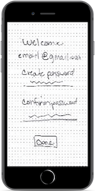
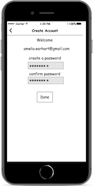
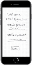
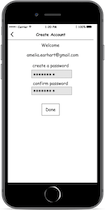
There were many steps along the way from the initial user research to the final prototype. Multiple iterations of sketches and wireframes ensuring all of the requirements were met, while having a smooth and functional flow for the user
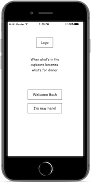
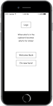
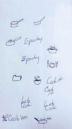
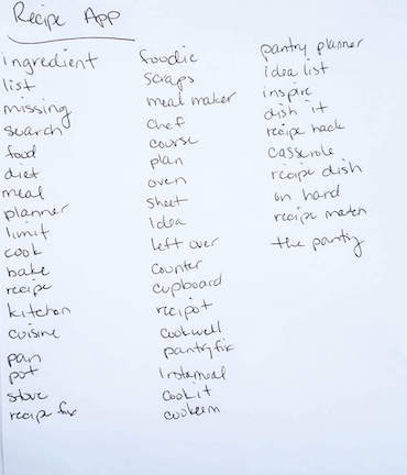
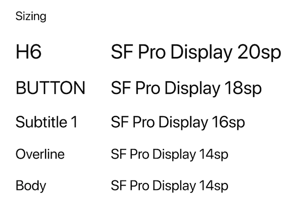
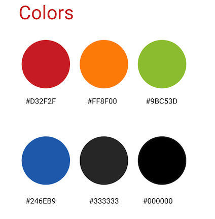
After having more of an idea what the product would look like, it was onto the brand. We wanted to create a brand that would evoke the feeling of energy and cheer so red and orange were used as our primary colors. We wanted a logo that would have a easygoing vibe, but also show the practicality of the product.


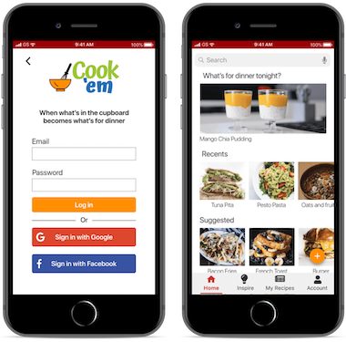
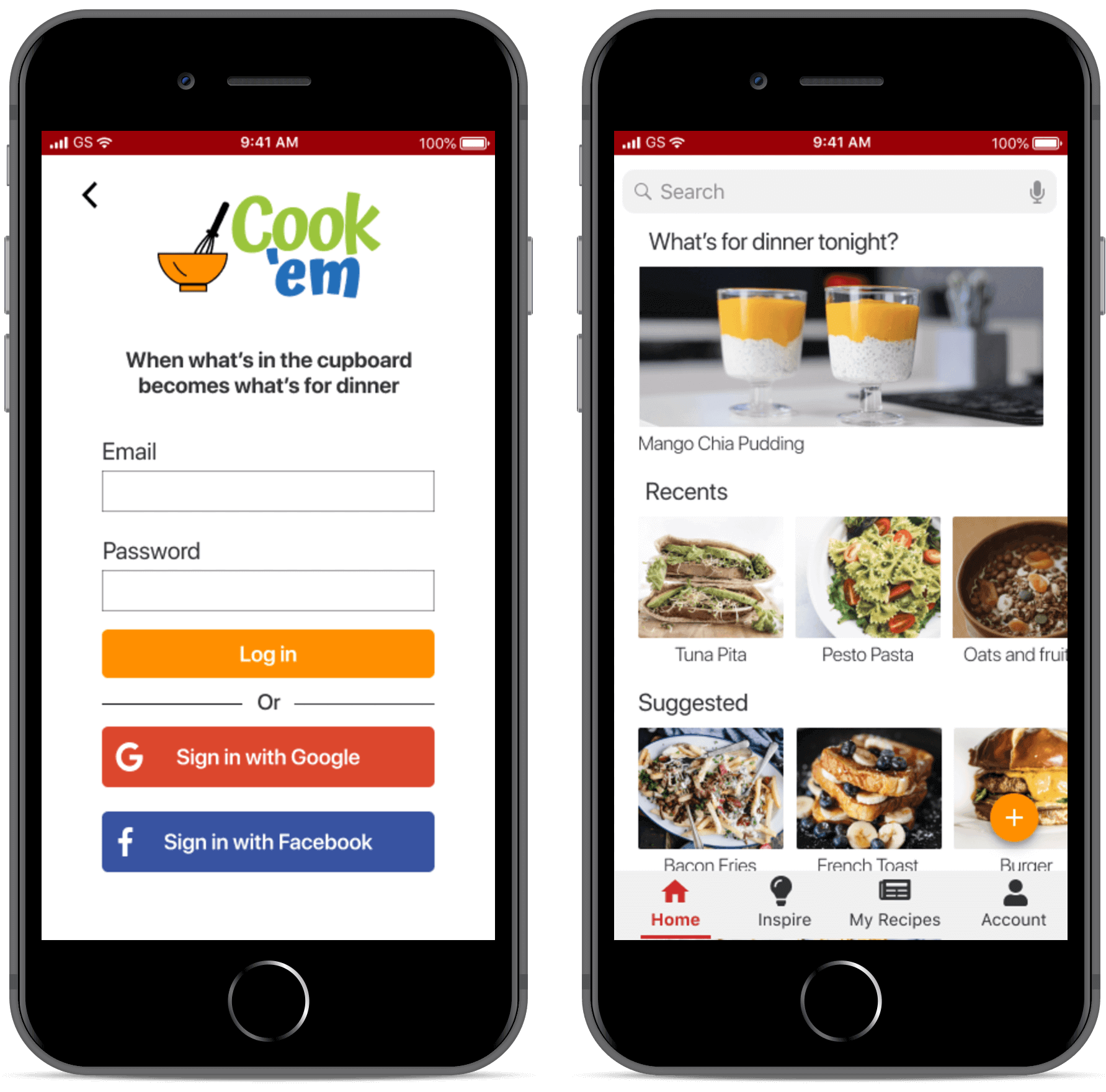
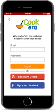
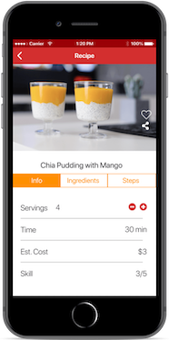
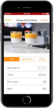
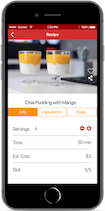
We created a prototype from the wireframes and had three users test some basic requests. We asked them to sign up for an account, upload a recipe, share a recipe and search by ingredient
Key Findings: Difficulty finding button to add or share recipe

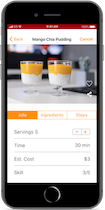
After we had our final prototype, we went through one more round of testing with new users. We asked what they would improved, how was the functionality and the overall experience. We made some modifications to colors and buttons to imporove the overall experience and accessibility.
When we were first tasked to create a new recipe app, we weren't sure where it would fit. After the initial research and learning what users want, we realized that by combining the right features, we could create a product that fills the users needs, and stands out from the crowd.